Fourier Transform - Evolutionary Art
Skip to demo
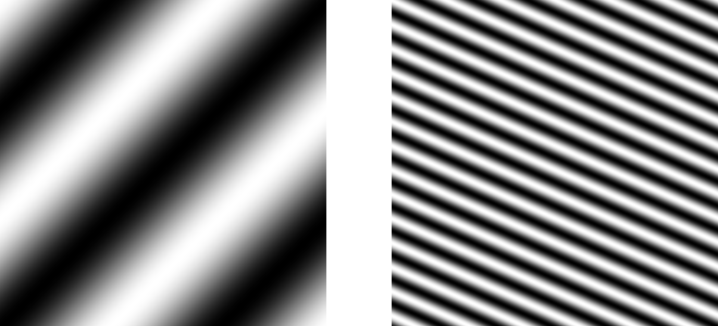
The Fourier Transform describes information in terms of frequencies. For sound and music, these frequencies explain the literal vibrations in the air. For images, these frequencies are 2-dimensional sinusoids (waves):
Stacking up a few of these 2-dimensional waves forms a dark blob.

Combining a few dozen more creates a graceful – still unrecognizable – shape. As we add more and more waves, notice how each image relates to the last.
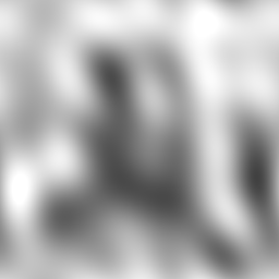
The fact that we’re dealing with waves means our image is very smooth (i.e. no sharp transitions) and fluid-like. However, by the time we’re up to a few hundred 2D waves, the image’s main shapes are clearly defined.

A couple thousand waves tells us we’re definitely looking at a face, though it’s not yet clear who we’re looking at.

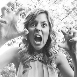
If we have one wave for each pixel in this $256\times 256$ image ($65,536$ waves in this case), then we can define it perfectly. Believe it or not, this was an image of the Youtuber Grace Helbig all along!
Space vs. Frequency
When an image is drawn to your screen, it’s drawn pixel by pixel. A pixel is a tiny square of color, and it’s difficult to see individual pixels because they blend together perfectly to form images. Pixels are spatial. They occupy some specific location in 2D space (3D pixels are called voxels), and they have a specific color associated with them. Thus, to talk about an image in terms of its pixels is to talk about it in terms of its spatial domain. But as we just learned, there are other ways to talk about images.
We learned how to describe an image as a combination of waves, which are pretty simple mathematical objects. Waves have frequency (how “wavy” they are) and phase (what direction they’re going). Here’s a wave with a very high frequency:
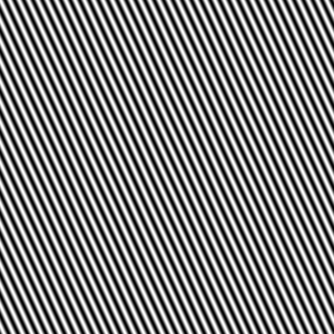
Here’s that same wave with a different phase:
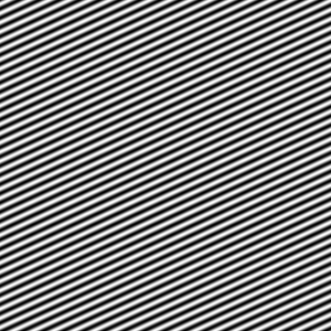
When we talk about an image’s constituent waves, we’re talking about its frequency domain, in contrast to its spatial domain, pixels. Pixels and waves are two valid and useful ways of thinking about images. The natural question is how do we move between these two totally different representations? How did I chose those few hundred waves that resulted in a blurry Grace Helbig?
The Fourier Transform
Space and frequency are two languages equally capable of talking about images. The spatial domain is Spanish. The frequency domain is French. The Fourier Transform is a Spanish to French translator (fun fact: Joseph Fourier was a French mathematician!). The Inverse Fourier Transform is, you guessed it, a French to Spanish translator.
The unfortunate problem with this ultra-convenient translator Fourier gave us is that’s it’s super slow. If you wanted to translate the pixels of a $1920\times 1080$ image into a bunch of waves, it’d take your computer a week or two to do the math! The Fast Fourier Transform, on the other hand, could do the same thing in a few seconds.
Randomness and Art
I’ve always been interested in random, computer-generated art pieces because it challenges the idea that art is something that is strictly human. I’ve explored this and created a demo based off of traditional ideas, but I wanted to give this problem another go with some of my own.
Generating a random image is super duper easy. Watch, here’s one:
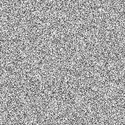
Boom! Here’s another:
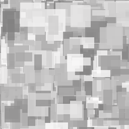
I’m willing to bet that not only do you believe the first image is more random than the second, but also that the second is more “artistic”. I assure you, the only difference between the two images is the size of the rectangles. In the first image, the rectangles are all $1\times 1$, so you don’t even know they’re there. In the second, the rectangles are of random sizes, meaning many of them are large and easy to see. In this way, the second image is even more random than the first. I also brightened up the colors of the second image, but that’s besides the point.
The point is art is always based on some sort of pattern, however subtle or blatant. Patterns are comforting, which is why the second image and its large areas of constant color are more pleasing, aesthetically, than the first.
These images are random in the spatial domain because I generated them by randomly picking physical spots for each rectangle. If you translate the pixels to French, err, the frequency domain, it turns out the waves you get are also pretty random. There are high and low frequency waves alike, with no clear patterns visible whatsoever.
By definition, patterns are restrictive. They include some very specific shapes, sounds, and ideas and reject all others. A question I had was whether this definition went both ways. Do restrictions necessarily result in patterns? If we restrict the frequency domain to low frequencies only, will we get white-noise-esque garbage or something more attractive? Will it matter which frequencies we choose so long as they are low?
This project explores how randomness in one domain (frequency) translates to art in another (spacial).
Low Frequencies and Genetic Algorithms
A genetic algorithm is one that borrows ideas from evolution (biological evolution). In this demo, you’ll be presented with images composed of a bunch of low frequency waves. You’ll choose your favorite, “killing” the rest of the images as they weren’t fit enough to survive (to earn your approval. Yeah, evolution is brutal). The image you choose seeds the next generation, meaning it’s used as the basis for all the new pictures. New pictures are slightly mutated versions of your choice. In this way, your creations inch towards the optimal image you have in mind. Warning: it may take a few million years to get decent results, depending on your standards.
Click on your favorite picture. Avoid clicking the top left image whenever possible to maximize diversity.
If you’d like to play around with this project, check out its github repository. I’ve already added multi-color functionality, but at this stage, I prefer black and white. See if you can make some awesome color images with this web app!