Universal Design - Redesigning My School's Band Room
Universal design is the process of crafting objects and buildings to suit as many people as possible. Despite the Americans with Disabilities Act of 1990, many public spaces still do poor jobs of accomodating people with disabilities. This blog post examines one such space, my high school’s band room, and provides suggestions as to how it can be improved.
My Redesign
The demo below requires WebGL. If it doesn’t work, upgrade to a modern browser like Chrome. Use W, A, S, and D to move around. Use Space and Shift to fly up and down. Use the arrow keys to rotate. Click to focus and begin, and click outside to exit.
Changes
The Sink
The first thing people notice when they walk into the band room is the random sink to the right of the door. The first issue with the sink is its placement. It is impossible for wheelchair users to navigate around it in its current orientation. Also, its position in the middle of what should be an open clearing poses a hazard for people with impaired vision.
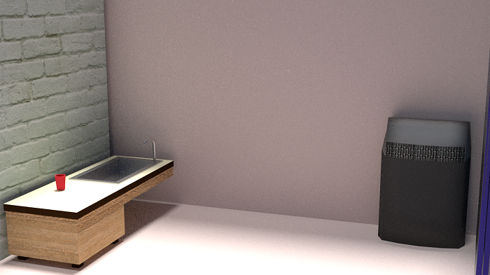
The easiest fix is to push the sink against the wall because doing so moves it out of the way and provides people with wheelchairs easier access. To accommodate this change, an automated faucet would need to be installed. For maximum comfort, the entire desk/sink should be closer to the ground, and there should be room beneath the sink to allow wheelchair users to slide in close. In my opinion, these changes make the sink a much more attractive fixture of the room, showing how adhering to the Social Minority Model (SMM) can inspire creative design solutions for everyone.
The Air Filter
The current band room’s layout is very confusing, with all of its twists, turns, and level changes, so I installed a purposely loud air filter as an audible landmark. I placed it at the beginning of the room so people would instantly be able to tell how far into the band room they are.
The air filter will also help people with allergies, like me, but everyone benefits from cleaner air. This demonstrates the fact that modifications that level the playing-field make everyone’s lives easier. If people don’t include others on their own, then learning about the Disability Rights Movement teaches them to do so for their own benefit.
The Ramps
Another unique characteristic of the band room is its multi-layered structure. There are three floors of desks, and no easy way for wheelchair users to navigate between them. Also, the steps could be quite jarring for blind people if their canes don’t make it immediately clear that there’s a drop.
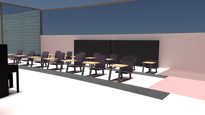
To fix the first problem, I installed ramps on both sides of the room. This way, people entering can take the shortest route to their desired destination, and people can loop around the entire room if necessary.
The Borders
To prevent the problem of tripping and falling, I created a border material on the edges of the steps. This way, people will know when they’re getting close to an edge. I also specifically colored each level of ramp a darker pink than the level above it because people with depth perception issues might not realize there’s a downward slope. Darker colors are an intuitive representation of depth.
At first, it was only obvious that the room needed one ramp. But by reflecting on the decisions of the Ed Roberts campus, I realized two ramps were optimal because of the difficulty people in wheelchairs have turning around. Keeping disabled people in mind when designing buildings teaches people to be more empathetic.
The Piano and Desk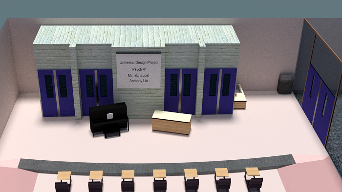
The piano and front desk were moved to reduce the clutter near the front of the classroom. This clears the way for wheelchair uses and makes the room look nicer overall. Likewise, the whiteboard was removed and a projection system was installed on the wall above the piano and desk. This makes it easier for everyone to read in-class presentations.
The Doors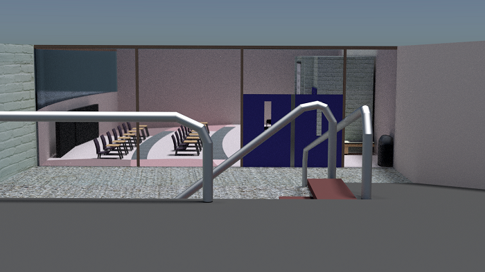
Making the manual doors automatic is a trivial change but an important one. I made all of the doors in the band room larger and automatic to give people in wheelchairs plenty of clearance when entering and exiting the building.
The Glass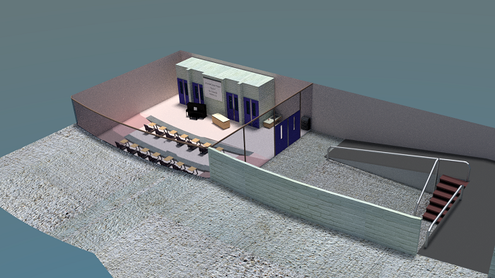
Figure 5: View from the outside, top down. Can see the brick and glass walls, the concrete upper area, and the ramp.
The band room currently looks pretty grim from the inside, so I replaced the back wall with glass. This will let in natural light during the day and allow people to see inside the newly designed building as they walk around the gym.
The Ceiling
One big problem with the band room is how reverberant it is. Whenever a few people sing and play instruments together, the loudest person’s echoes drown out everyone else. The echoes make it hard to stay focused on the music, which impedes practices. Even worse, it’s impossible for two groups of people to play different pieces at the same time because each group can hear the other.
To fix these issues, I installed a stretchy fabric material under the ceiling to absorb the noise (not shown in the images due to the impracticality of setting up ceiling-specific light sources and the fact that it would just be a flat plane). This feature wouldn’t interfere with nearby sounds, but it would prevent noises from echoing and traveling too far. Again, this benefits everybody, but people with difficulty hearing would benefit the most. This speaks to the fact that universal design isn’t specific to disability but rather to humans (and maybe animals too).
Impact
What are the ways in which the Social Minority Model, the Disability Rights Movement, and a study of Disability expand our understanding and enrich our world?
The Social Minority Model increases people’s understanding by opening their eyes to diversity. By making simple changes to the environment instead of to the people, the SMM shows everyone how easy it is to be inclusive. It consequently gives disabled people the option to preserve their identities, enabling them to actively participate in the rest of society. The SMM therefore makes it easier for Disability activists to fight for their rights.
The Disability Rights Movement is an excellent source of upstanders. It inspires repressed people everywhere not because it involves disabled people but because it saw great success despite ancient stigmas hindering its progress. Lastly, it’s important to study Disability because it challenges one’s prejudices. I didn’t have any ill feelings towards disabled people before this unit in Psychology class, but I never thought critically about Disability before either. Now that I’ve thought significantly more about it, I am more confident in my ability to be a tolerant human being.